Preview Fewer Looks font with your text


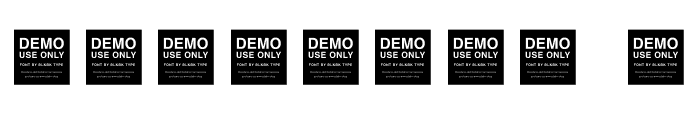
Fewer Looks font
Publisher
N/A
License
$ Commercial
Date added
Jul 29 2025
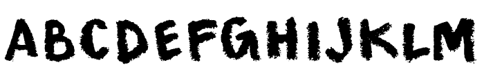
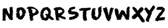
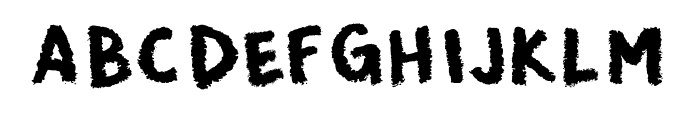
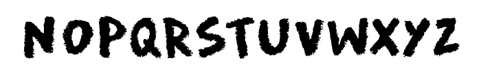
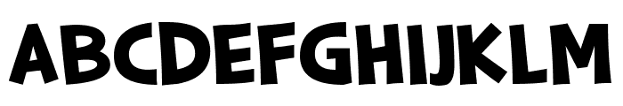
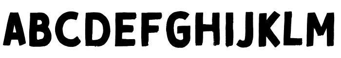
Bold, textured, hand-drawn style with a brush-like appearance.
This font features a bold, textured appearance with a hand-drawn style. The characters have a rough, brush-like texture that gives them a dynamic and energetic feel. The uppercase and lowercase letters maintain a consistent style, with slightly irregular edges that add to the handcrafted look.
Ideal for artistic projects, posters, branding, and any design requiring a bold, creative touch.
Headlines, Logos, Posters
Balanced
Download Fewer Looks font. Fewer Looks by
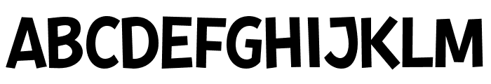
Ideal for artistic projects, posters, branding, and any design requiring a bold, creative touch.
Headlines, Logos, Posters
Balanced
Category
Bold
Yes
Italic
No
Weight
Bold
Width
Normal
Character spacing
Normal
Line height
Normal
Contrast
Medium
Overall style
Decorative
X height
Medium
Cap height
High
Similar Free Fonts for Fewer Looks
$ Free > Personal Use
$ Free > Personal Use
Similar fonts for Fewer Looks from Adobe.com
$ Commercial > Adobe.com

$ Commercial > Adobe.com
Similar fonts for Fewer Looks from MyFonts.com

$ Commercial > MyFonts.com

$ Commercial > MyFonts.com
Similar fonts for Fewer Looks from CreativeMarket.com

$ Commercial > CreativeMarket.com

$ Commercial > CreativeMarket.com
Help your fellow font-seekers if you think you can recognize the font. Earn some good karma by doing it :-) Answer & Help

Yet sometimes the images are very complex, so other users need a bit of help.
If you recognize the font from the samples posted here don't be shy and help a fellow designer.
Thousands of designers (famous or not) use the image font detection system to find a font or similar free fonts from an image. Although we have the largest database of fonts, the search for a font from an image gets mixed results like the image above.
Recognize the font? Browse forumHave a font you want to use on the web?
Webfont Generatorin seconds.